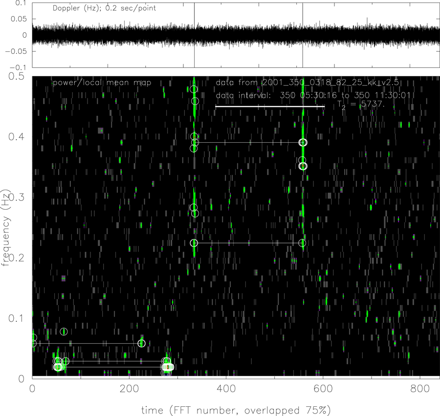
Figure 16: Frequency-time representation of Cassini two-way Ka-band data on 2001 DOY 350.
Upper panel: time series of two-way Doppler data with  1 s time constant, sampled at
0.2 s/sample. At this resolution the visual impression of the plot is set by relatively high frequency
noise. Lower right panel: low frequency resolution power spectrum of the full data set shown in
upper panel. Lower left panel: normalized dynamic spectrum of the data in the upper panel. This
was constructed by forming sequential spectra of short (
1 s time constant, sampled at
0.2 s/sample. At this resolution the visual impression of the plot is set by relatively high frequency
noise. Lower right panel: low frequency resolution power spectrum of the full data set shown in
upper panel. Lower left panel: normalized dynamic spectrum of the data in the upper panel. This
was constructed by forming sequential spectra of short ( 102 s) unwindowed segments of the
data. Each data segment is 75% overlapped with its neighbors. The heavy white line indicates the
two-way light time at the beginning of the data set. The plotted quantity is power at a given
point in (frequency-time) divided by a local estimate of the average power at that (frequency, time)
point, a nondimensional measure of the contrast of the Fourier power at that point relative to an
estimated background. The color code runs from black (low values) through green (higher values) to
red (very high values). Points with this estimated contrast ratio > 10 are marked with white circles.
If two high-contrast features are at the same frequency and separated by a two-way light time, they
are connected with a thin white line. The FTS glitch shown also in Figure 8 is clearly evident in
both the time series and in T2-separated bands of high-contrast Fourier power in the lower plot.
Additional features paired at T2 in the earlier, lower-frequency part of the data are also detected in
the normalized dynamic spectrum.
102 s) unwindowed segments of the
data. Each data segment is 75% overlapped with its neighbors. The heavy white line indicates the
two-way light time at the beginning of the data set. The plotted quantity is power at a given
point in (frequency-time) divided by a local estimate of the average power at that (frequency, time)
point, a nondimensional measure of the contrast of the Fourier power at that point relative to an
estimated background. The color code runs from black (low values) through green (higher values) to
red (very high values). Points with this estimated contrast ratio > 10 are marked with white circles.
If two high-contrast features are at the same frequency and separated by a two-way light time, they
are connected with a thin white line. The FTS glitch shown also in Figure 8 is clearly evident in
both the time series and in T2-separated bands of high-contrast Fourier power in the lower plot.
Additional features paired at T2 in the earlier, lower-frequency part of the data are also detected in
the normalized dynamic spectrum.
1 s time constant, sampled at
0.2 s/sample. At this resolution the visual impression of the plot is set by relatively high frequency
noise. Lower right panel: low frequency resolution power spectrum of the full data set shown in
upper panel. Lower left panel: normalized dynamic spectrum of the data in the upper panel. This
was constructed by forming sequential spectra of short ( 102 s) unwindowed segments of the
data. Each data segment is 75% overlapped with its neighbors. The heavy white line indicates the
two-way light time at the beginning of the data set. The plotted quantity is power at a given
point in (frequency-time) divided by a local estimate of the average power at that (frequency, time)
point, a nondimensional measure of the contrast of the Fourier power at that point relative to an
estimated background. The color code runs from black (low values) through green (higher values) to
red (very high values). Points with this estimated contrast ratio > 10 are marked with white circles.
If two high-contrast features are at the same frequency and separated by a two-way light time, they
are connected with a thin white line. The FTS glitch shown also in Figure 8 is clearly evident in
both the time series and in T2-separated bands of high-contrast Fourier power in the lower plot.
Additional features paired at T2 in the earlier, lower-frequency part of the data are also detected in
the normalized dynamic spectrum.